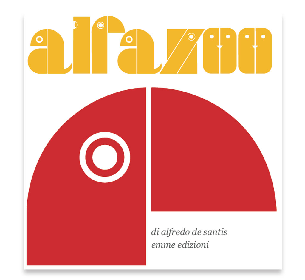
ALFAZOO
Book cover
Emme Edition, Milan 1968
Character interventions
Two letters of the Alphabet

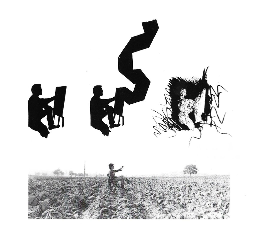
THE FLYING CARPET
Die-cutter painter – Painter with carpet
Pencil painter – Photo protrait, 1972
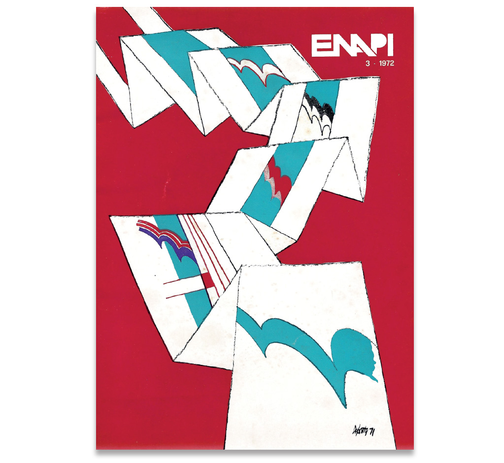
ENAPI book cover, 1971
GRAPHICUS book cover, 1974
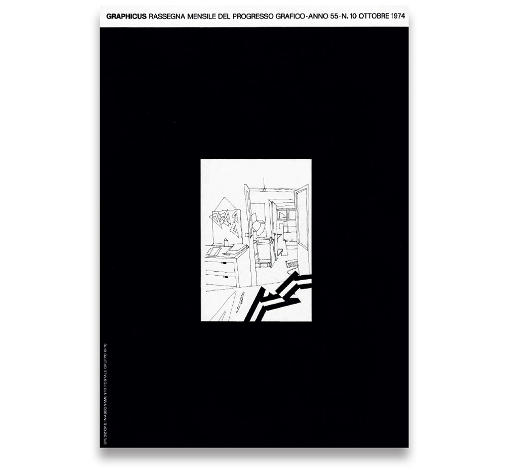
ARFLEX ROME
Poster for the exhibition
Graphic and Serigraphs, 1971
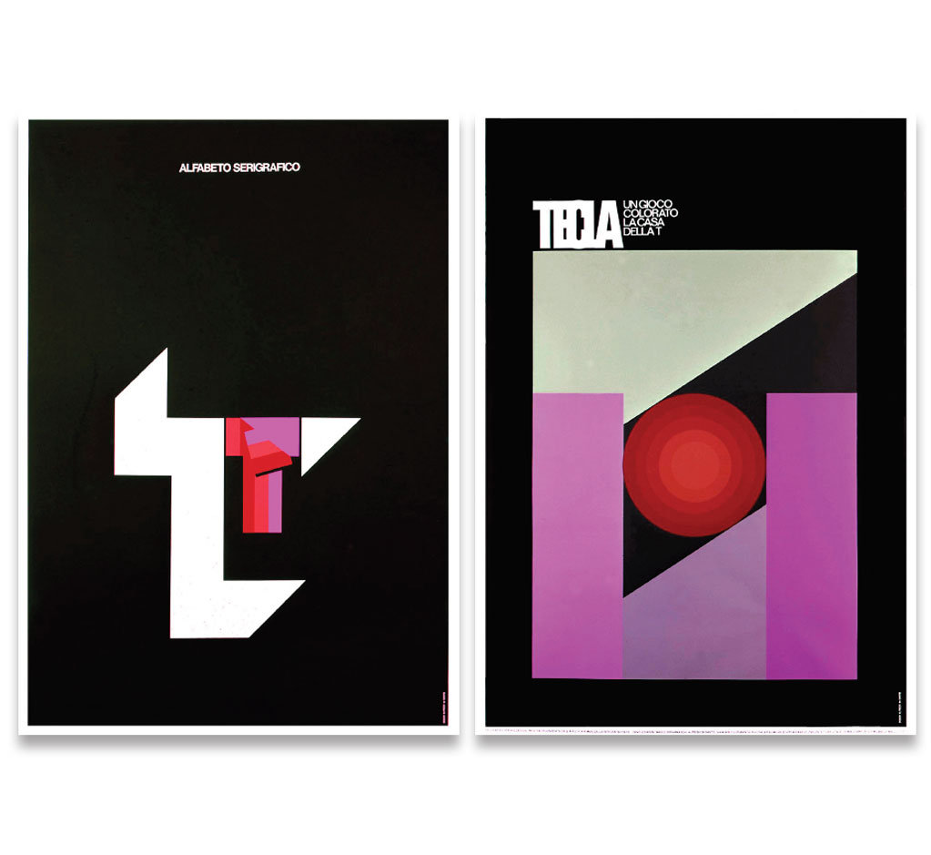
PSIUP
Posters, 1972

THE AMERICA EYE
Book cover and drawings
for a folder of lithographies
New York, 1974
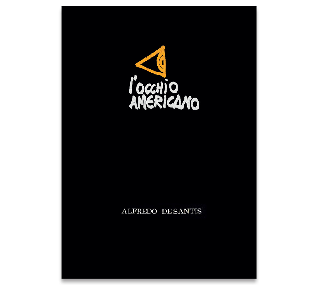
Lithography
New York, 1974
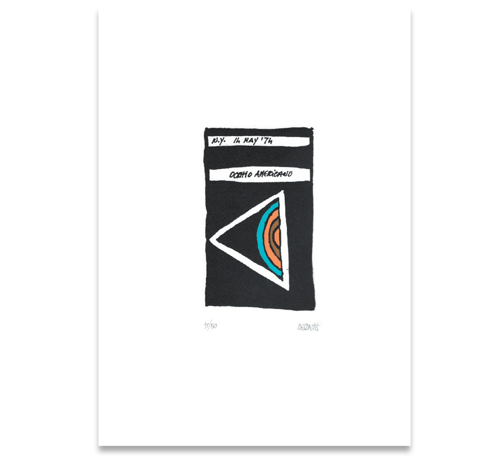
Lithography
New York, 1974
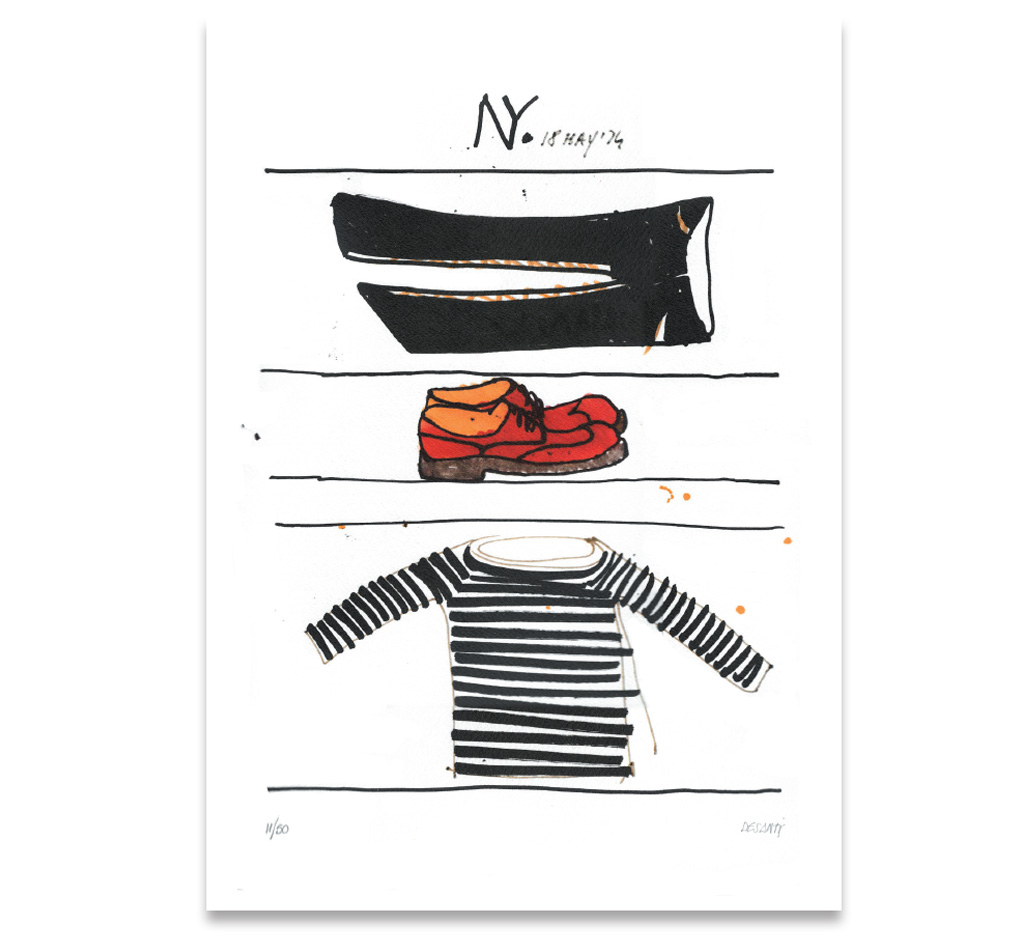
Lithography
New York, 1974
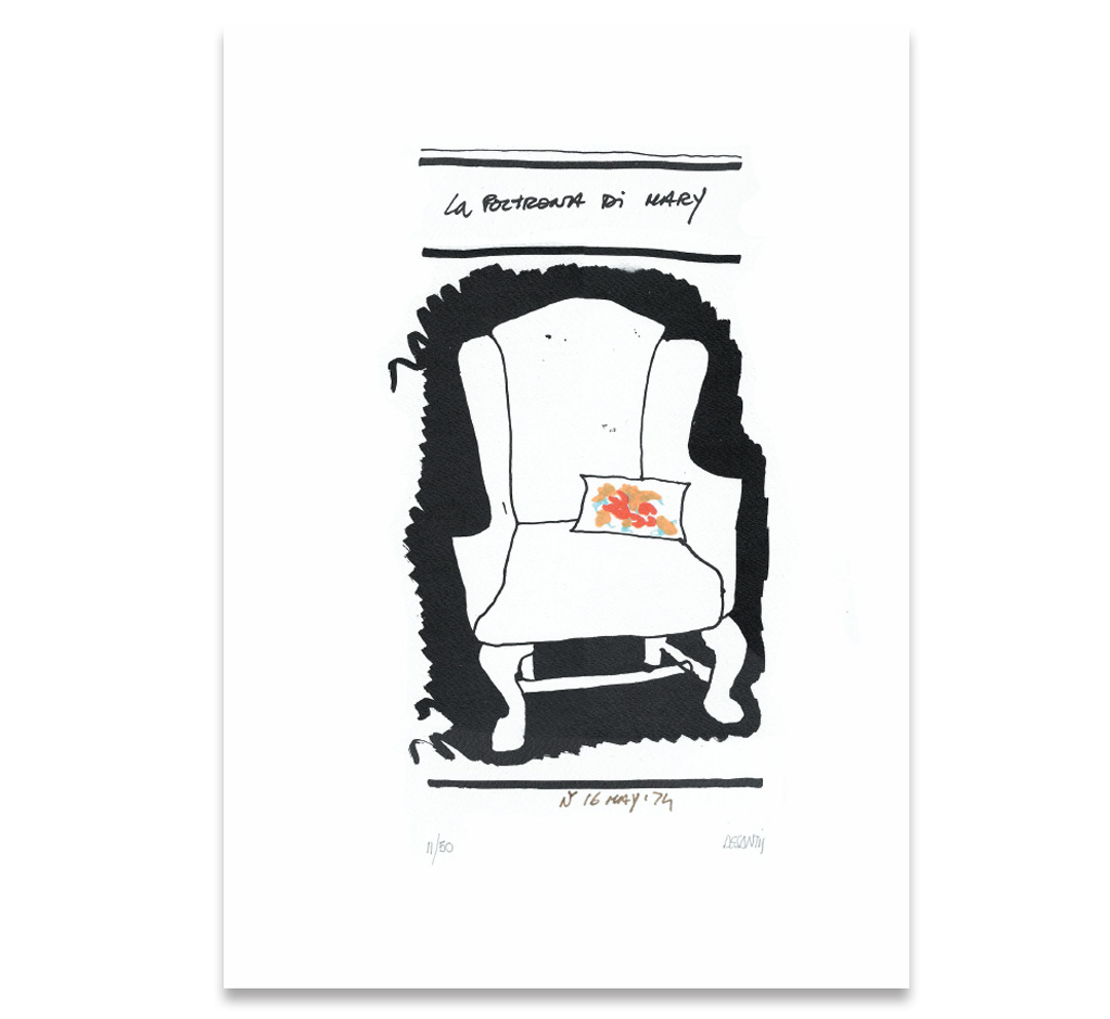
Lithography
New York, 1974
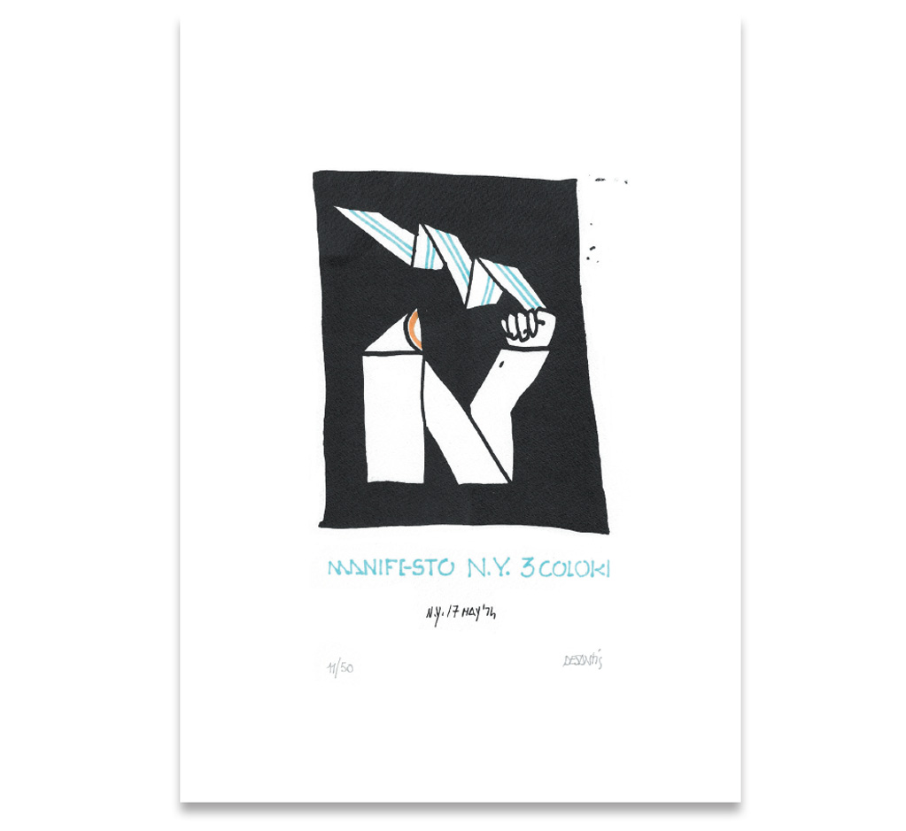
Lithography
New York, 1974
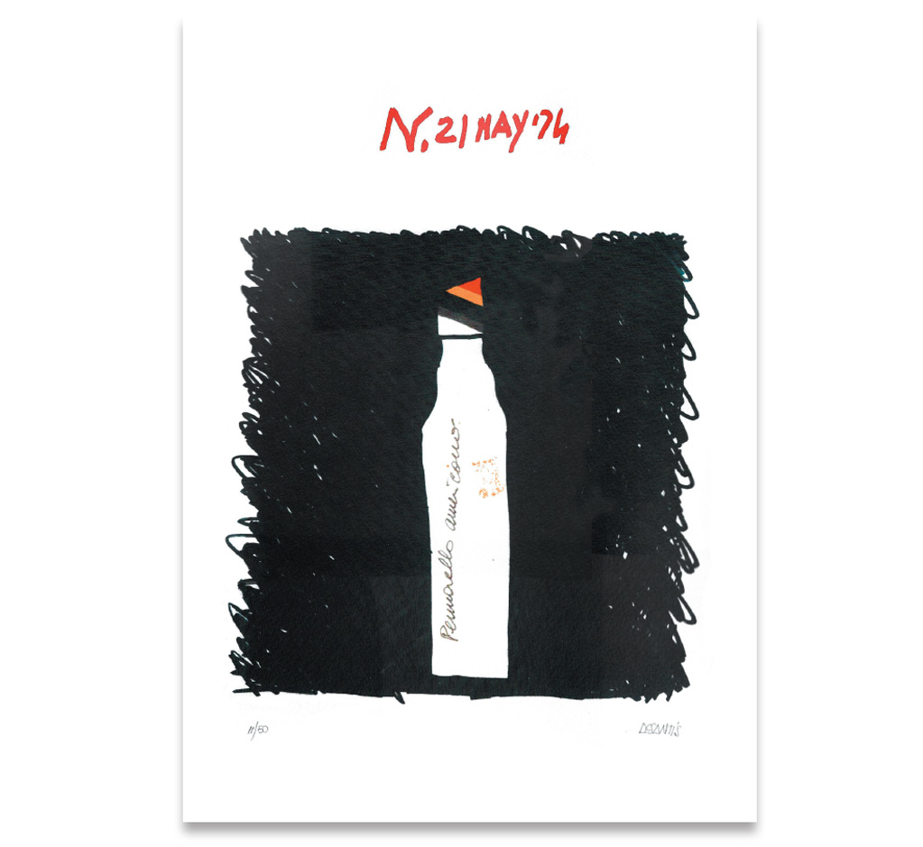
Lithography
New York, 1974
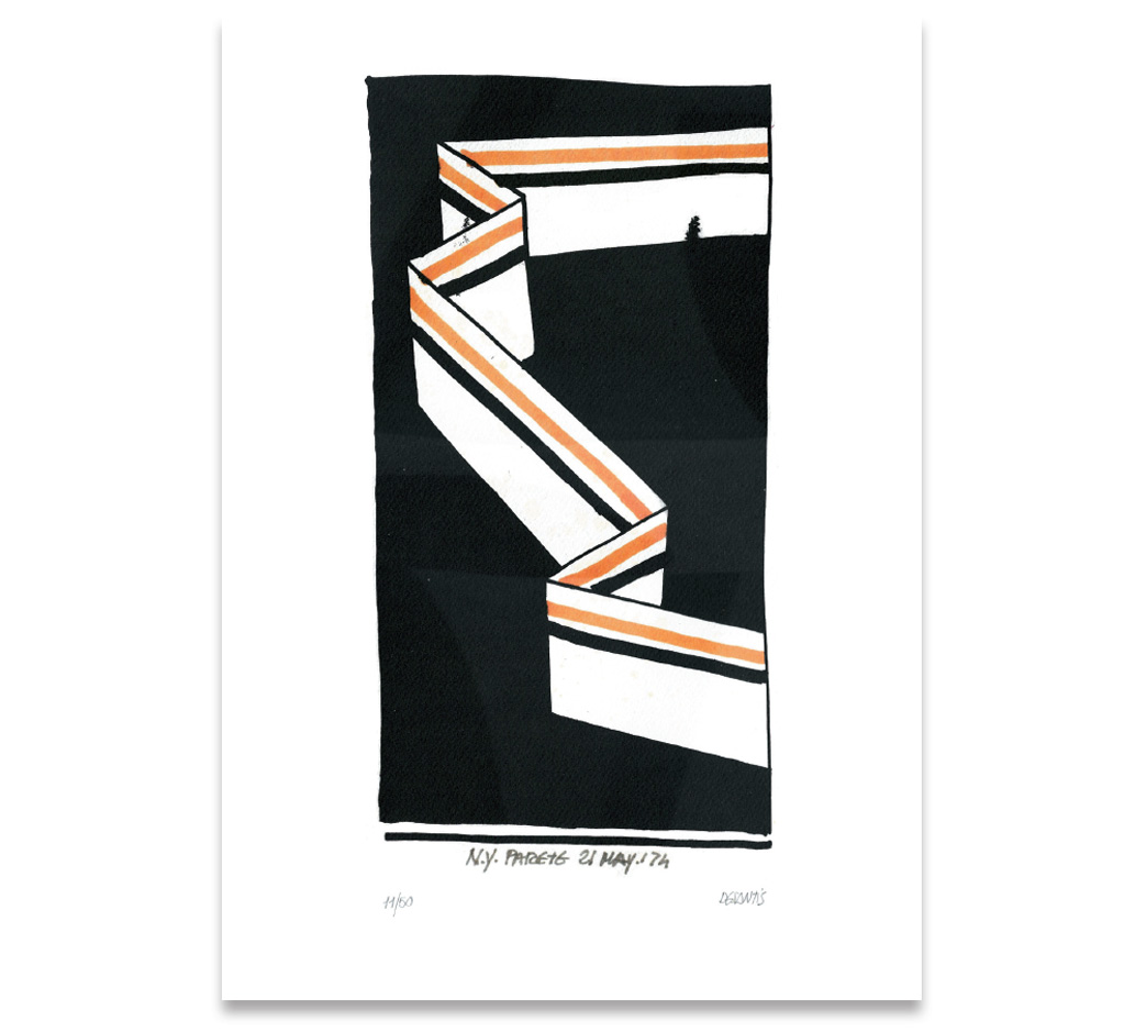
MARY’S ARMCHAIR
Two colour lithography
Serigraph folder,
Stampa Fraire, Rome, 1974
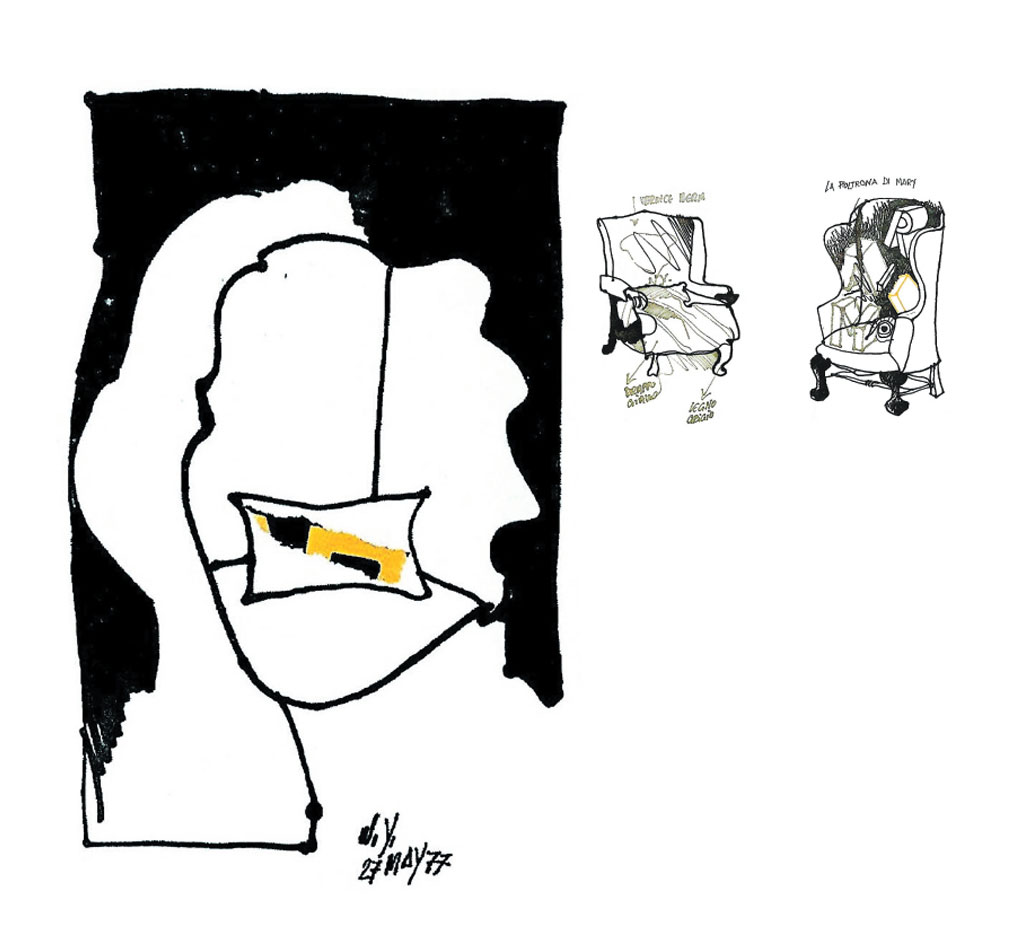
MARY’S PORTRAIT
Drawing and collage, New York, 1977
2 Felt pens on paper, New York, 1974
MARY’S ARMCHAIR
Book cover and book project,
Rome, 1977
POSTERS
Tudor, 1972
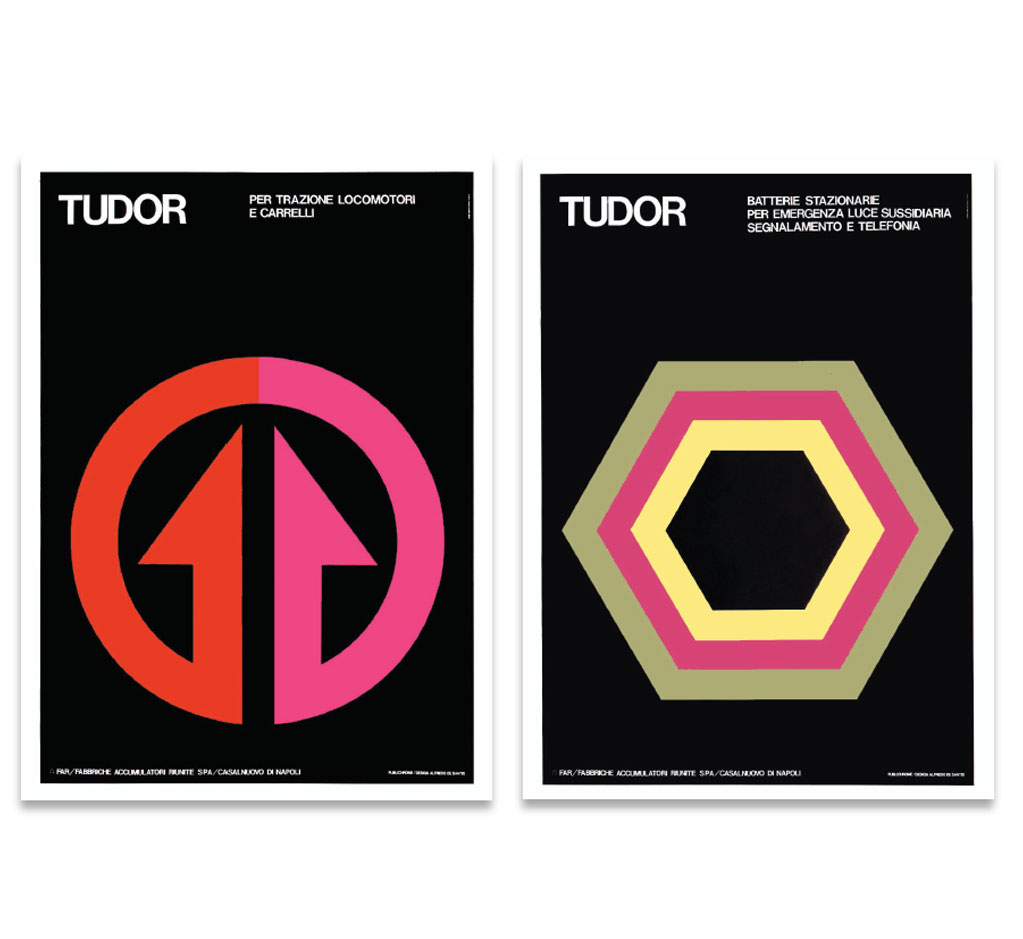
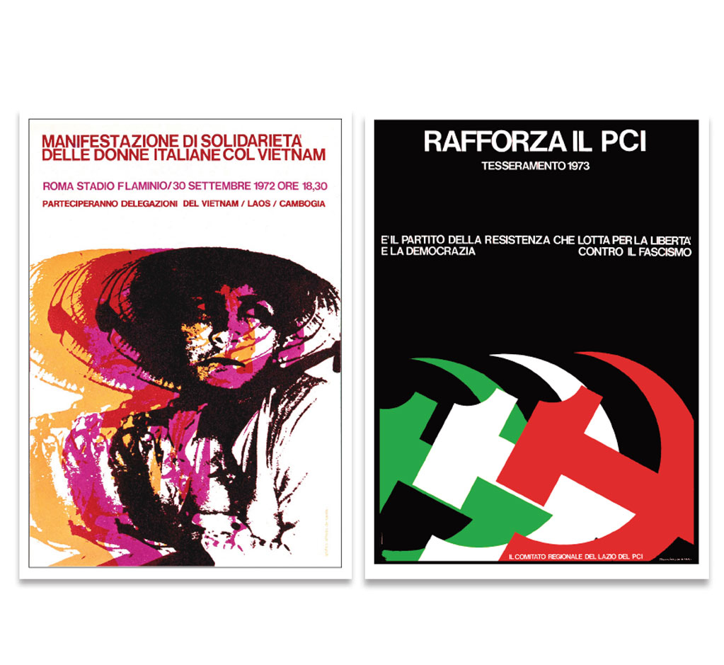
POSTERS
Italian Communist Party
Rome, 1972 – 1973
Rome, 1975 – 1976
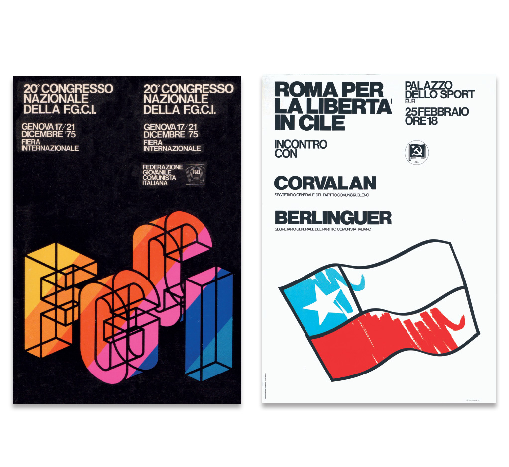
Rome, 1975 – 1976

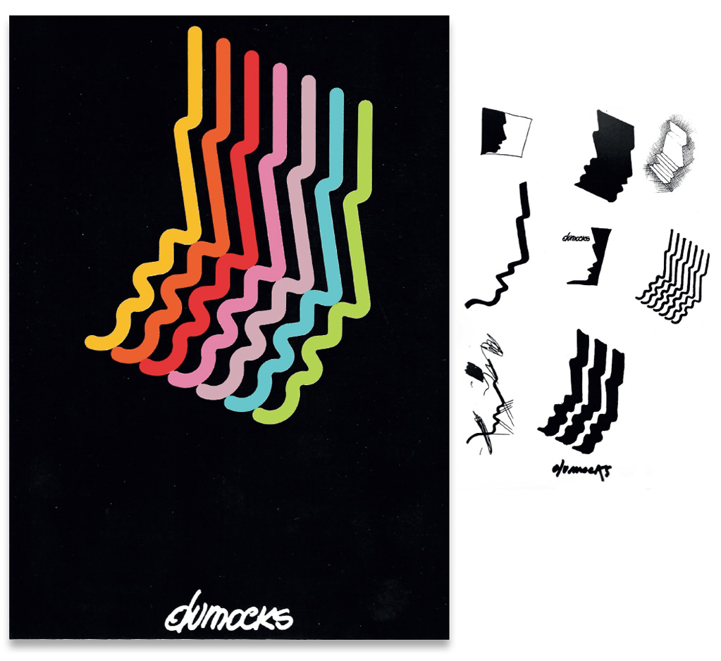
DUMOCKS
Logo and Manifesto for a
music recording studio
Rome, 1976
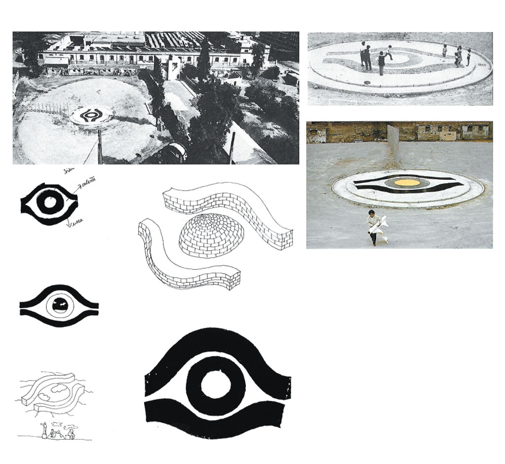
THE EARTHLY EYE
Intervention at Central Park
of Via Sabotino in Rome,
Roman Summer, 1979
TELEVISION THEMES
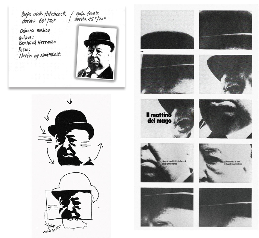
Alfred Hitchcock, 1978
Head theme and notes
of the story-board
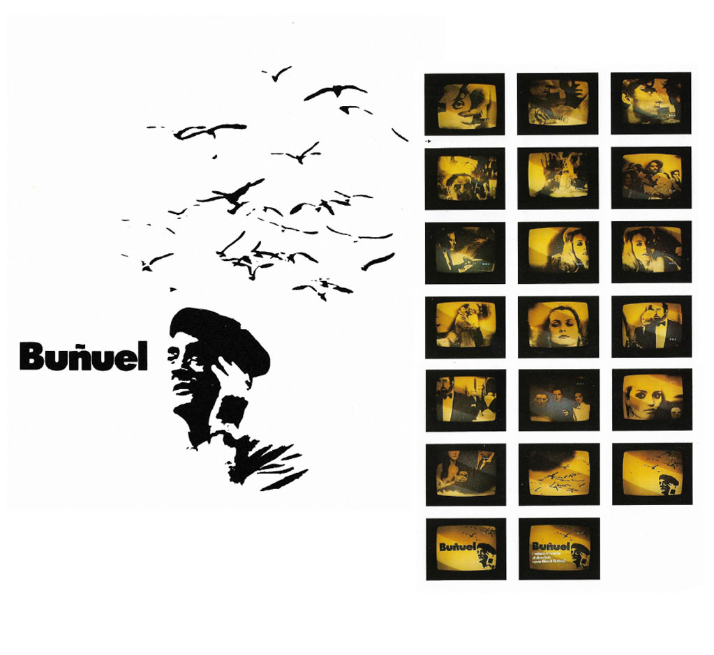
Luis Bunuel, 1980
video shooting
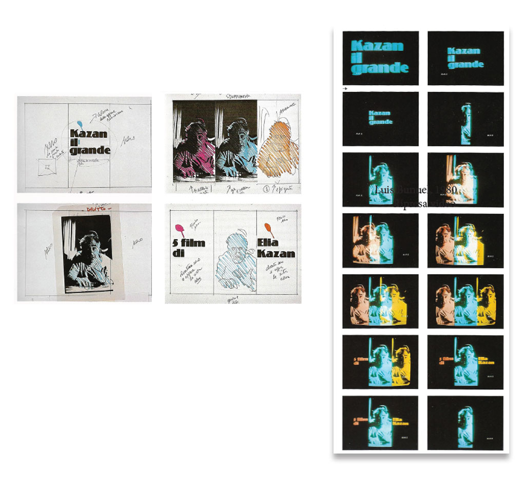
Elia Kazan, 1981
Notes of the story-board
and video shooting
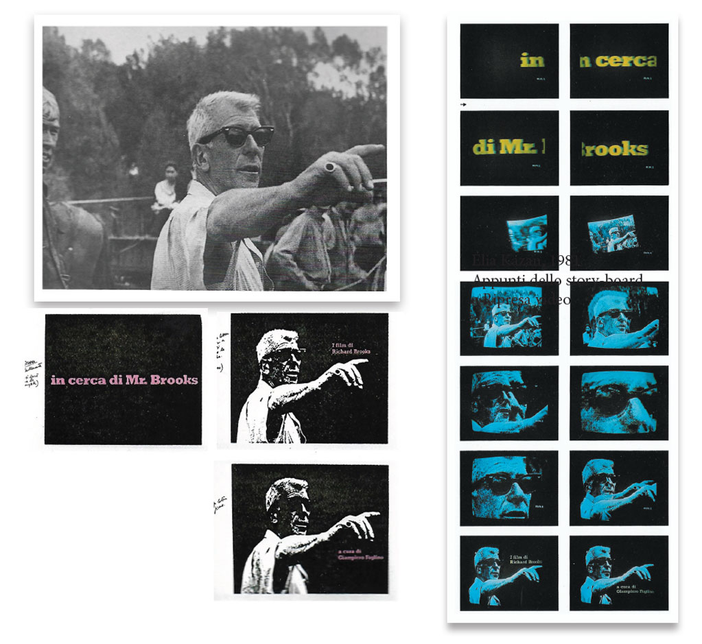
Richard Brooks, 1982
Photo of film director and
video shooting
THE SILHOUETTE
Graphic image of the review
“The days of silent film”
Pordenone, 1982
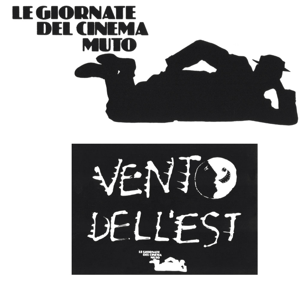
Poster
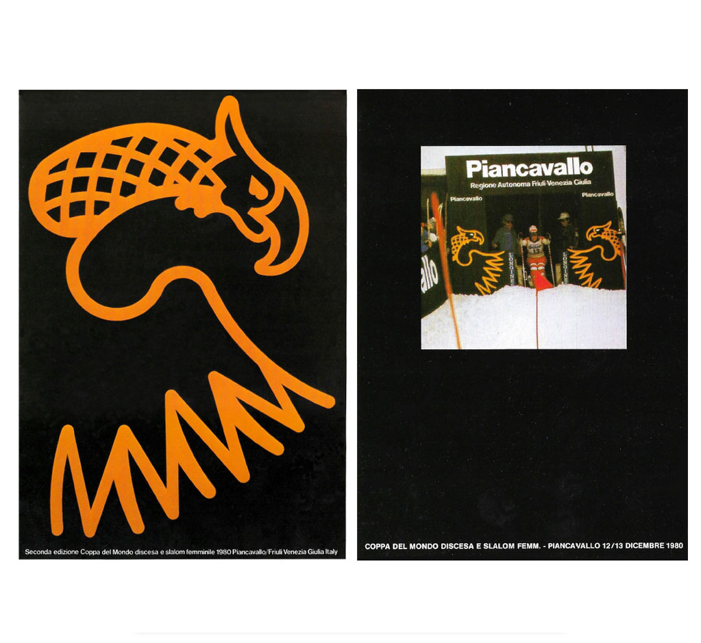
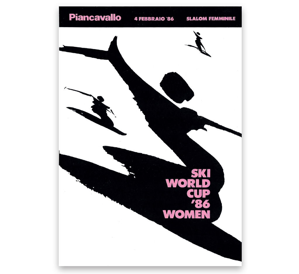
THE PINK SKI
Graphic Image of the downhill race
and women's slalom
of the World Cup
Piancavallo, Friuli V. G. 1980-1986
Poster 1980
Poster, 1982
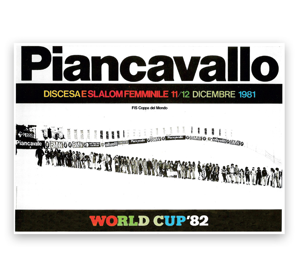
Poster, 1983
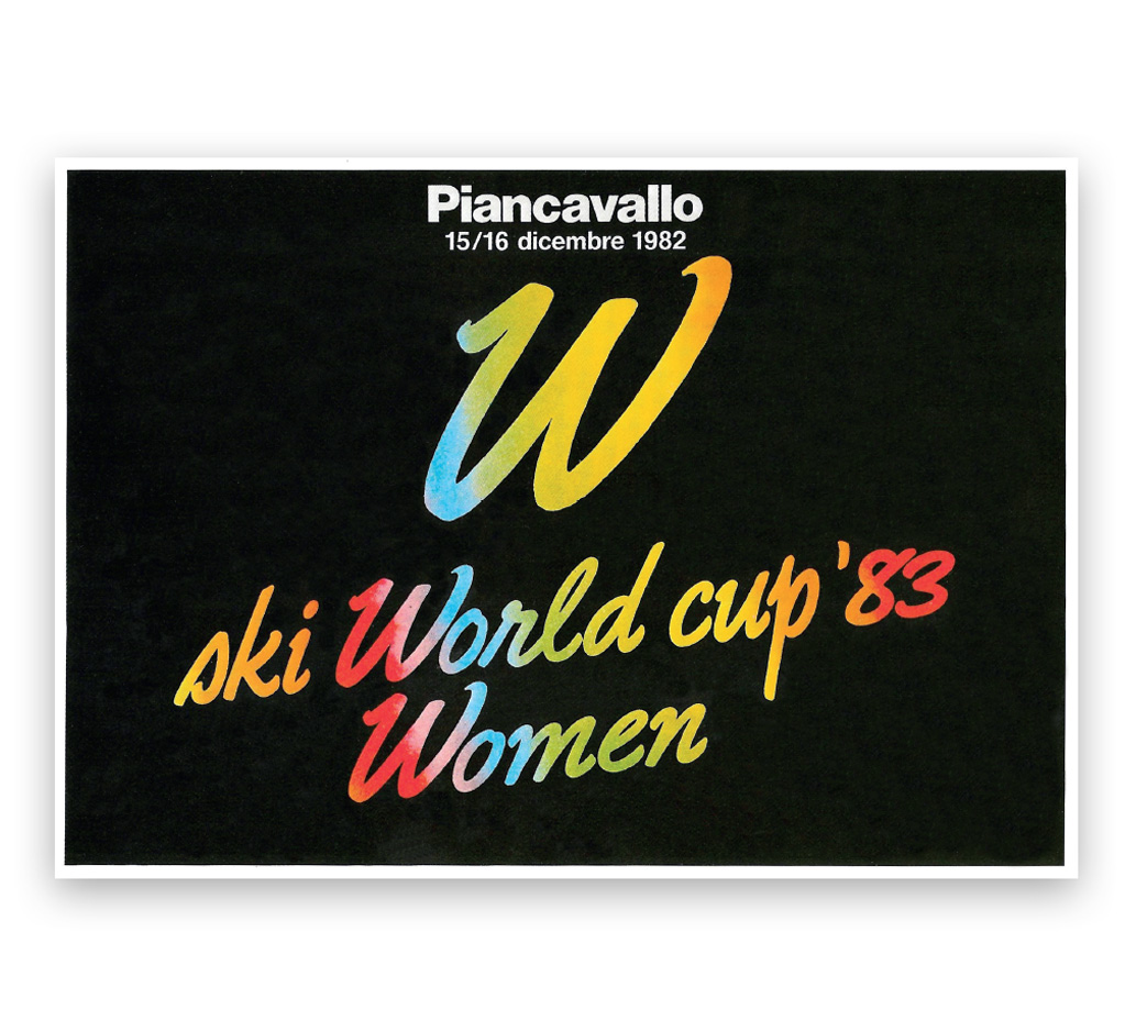
Poster, 1983
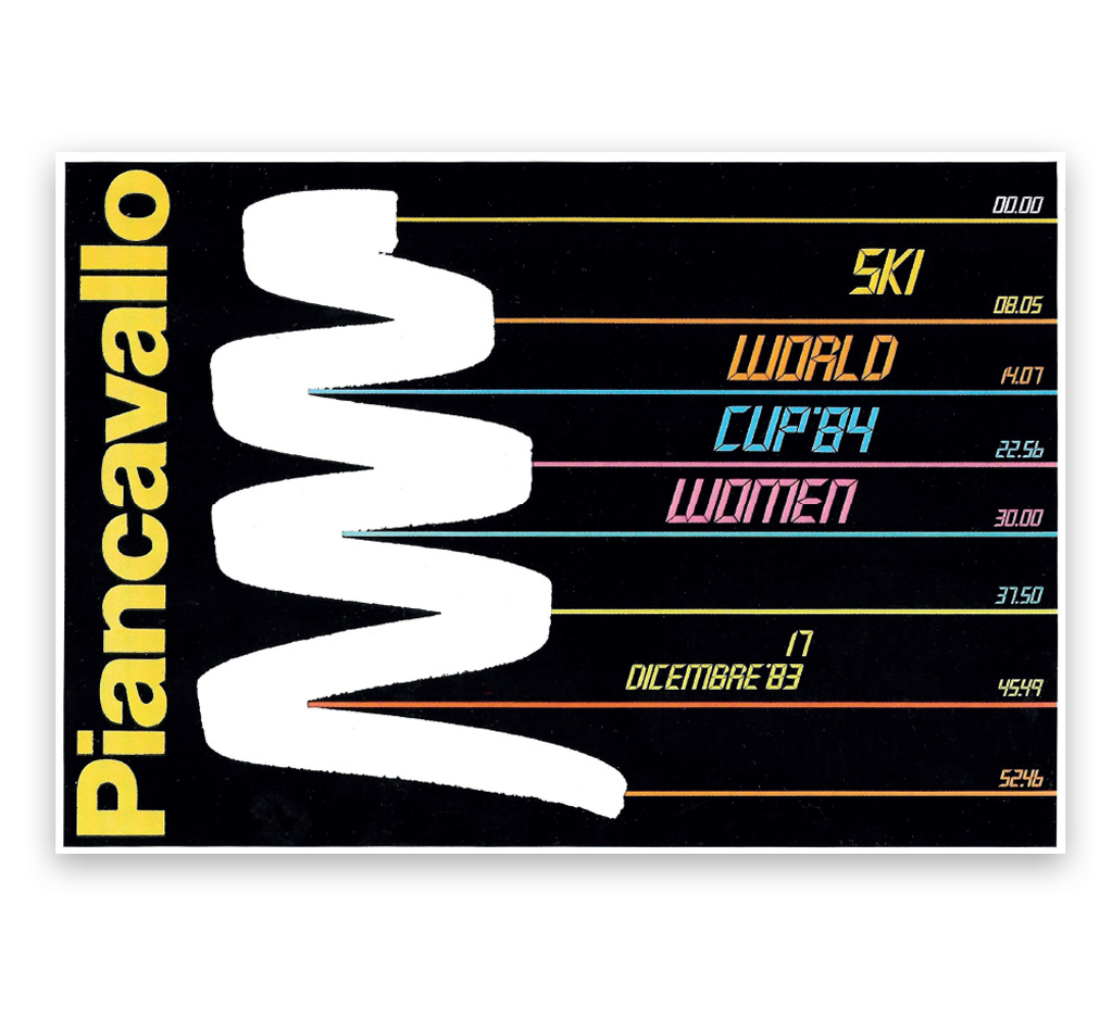
Poster, 1984
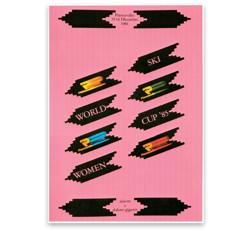
Poster, 1985
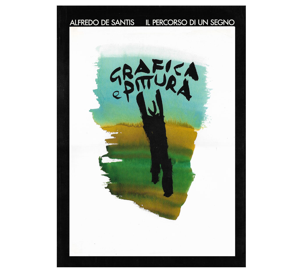
BOOK COVER
The path of a sign
Vianello Libri – Ponzano – Treviso 1986
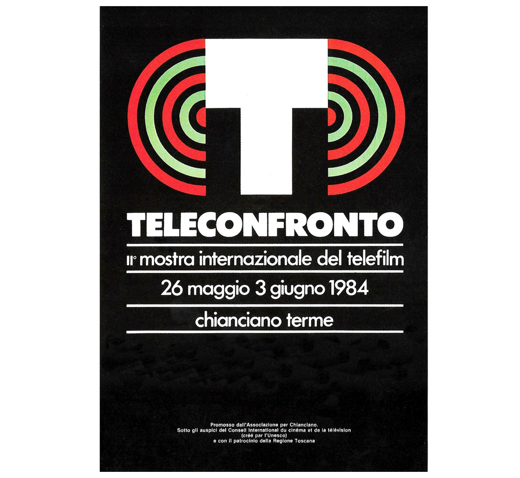
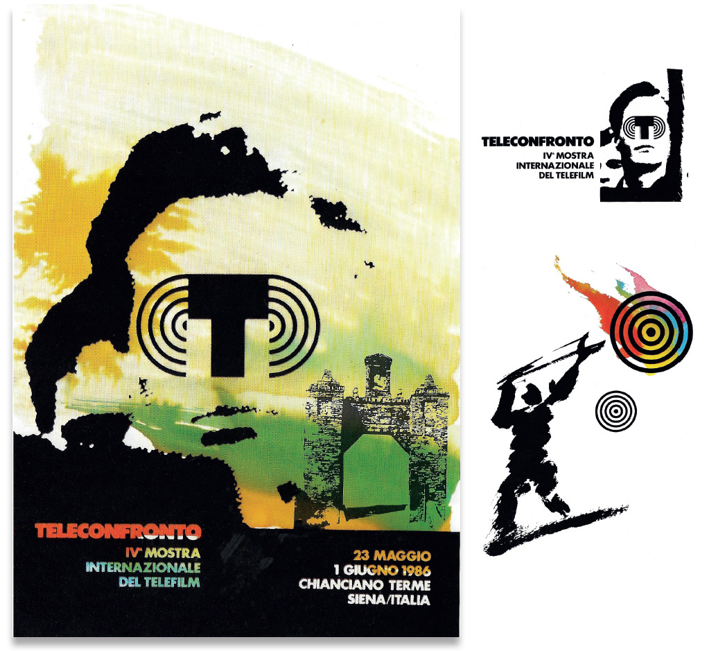
THE LUMINOUS POINT
Television debate
International exhibition
of TV serial 1983-1986
Poster 1984
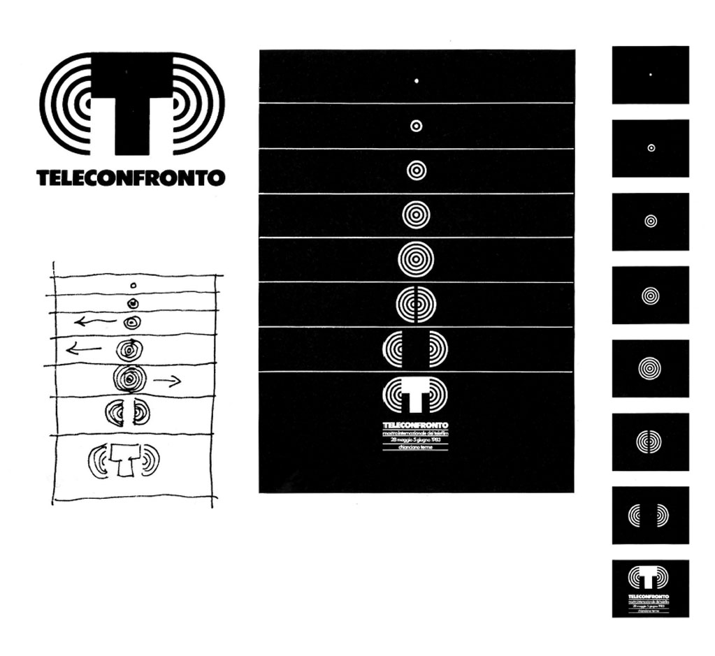
Logo and story-board for the head theme
of television debate
Drawings for the book cover
“R.W. Fassbinder TV”
Del Grifo Editors Book cover – Montepulciano
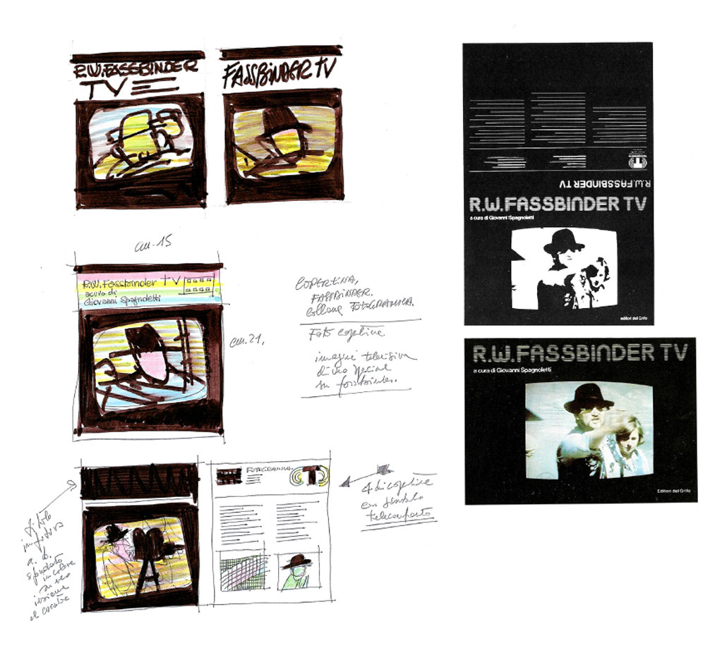
Portrait, colour test
Portrait and Lettering
Man with slingshot, ink drawing
MANIFEST SIGNS
Periodical illustrations
for the daily newspaper “Il Manifesto” 1985
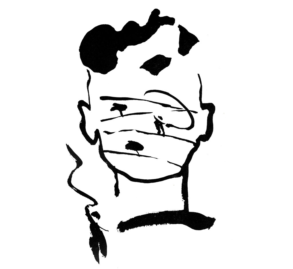
Drawings with India ink
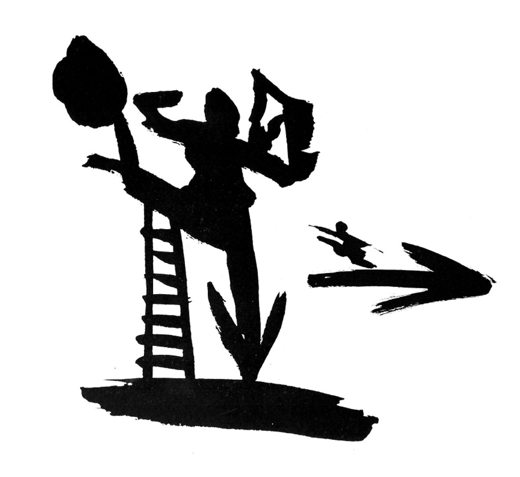
Drawings with India ink
CIACK
Italian comedy
a research project, Rome 1985
Poster and logo
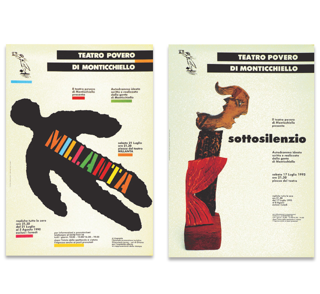
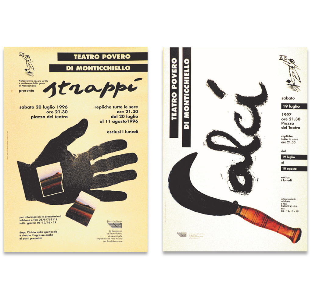
TEATRO POVERO DI MONTICCHIELLO
Logo – Symbol – Type face
Posters 1987 – 1989
Posters 1990 – 1993
Posters 1996 – 1997
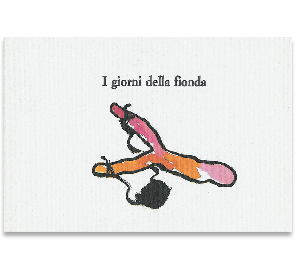
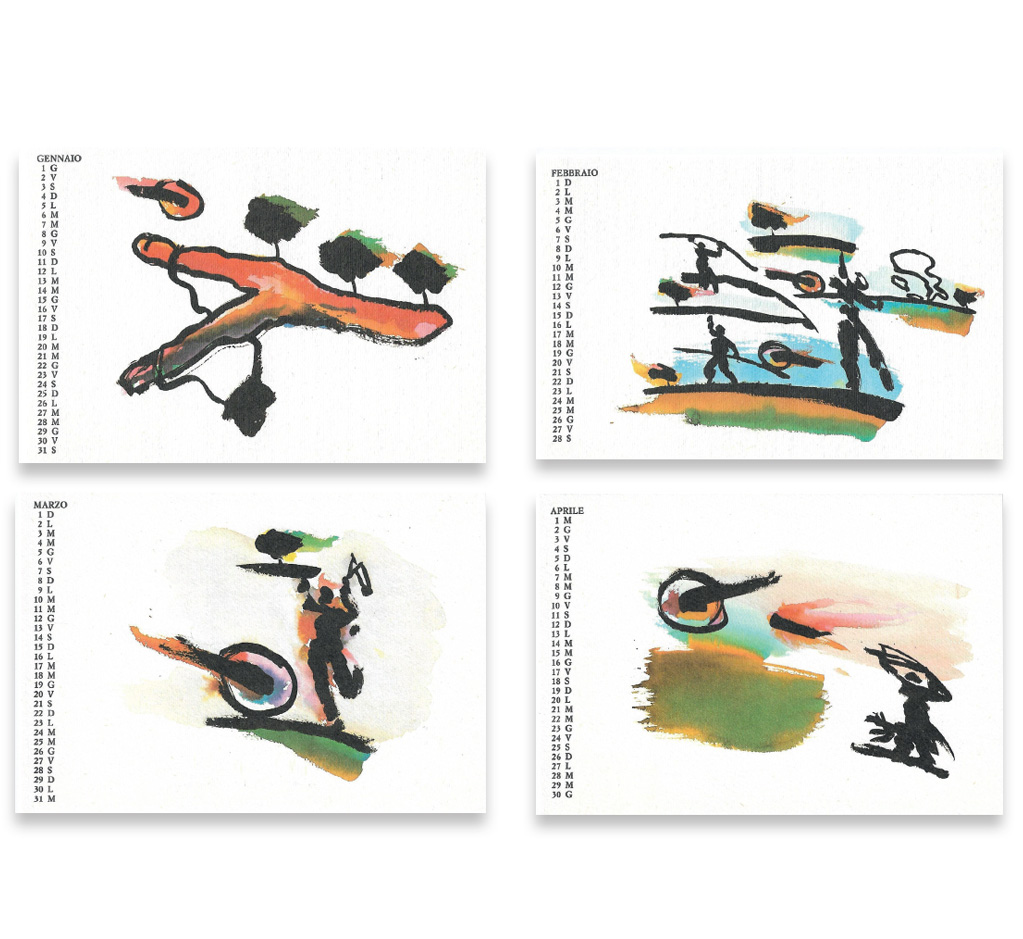
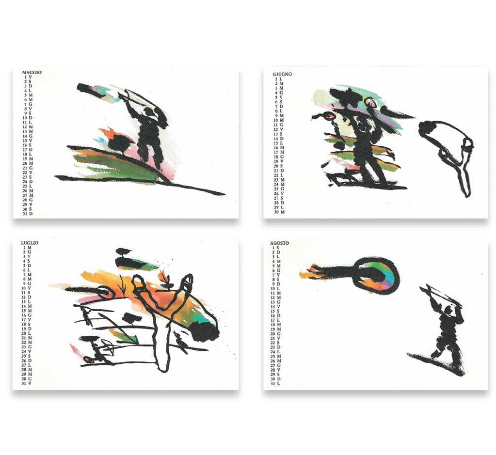
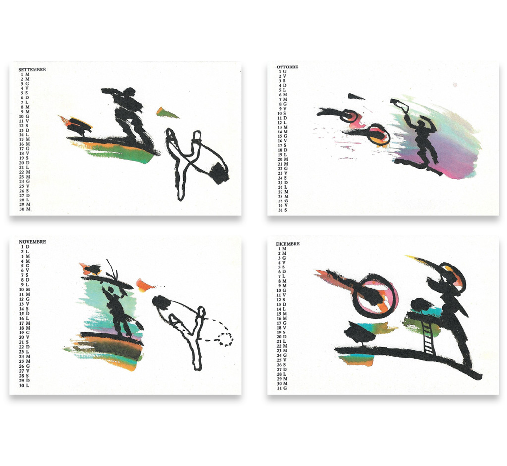
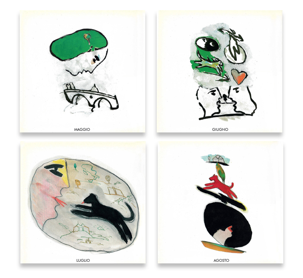
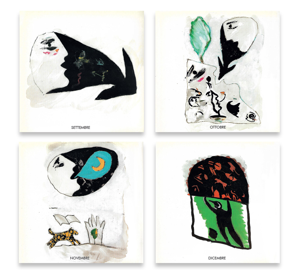
THE DAYS OF THE SLINGSHOT
Calendar 1986
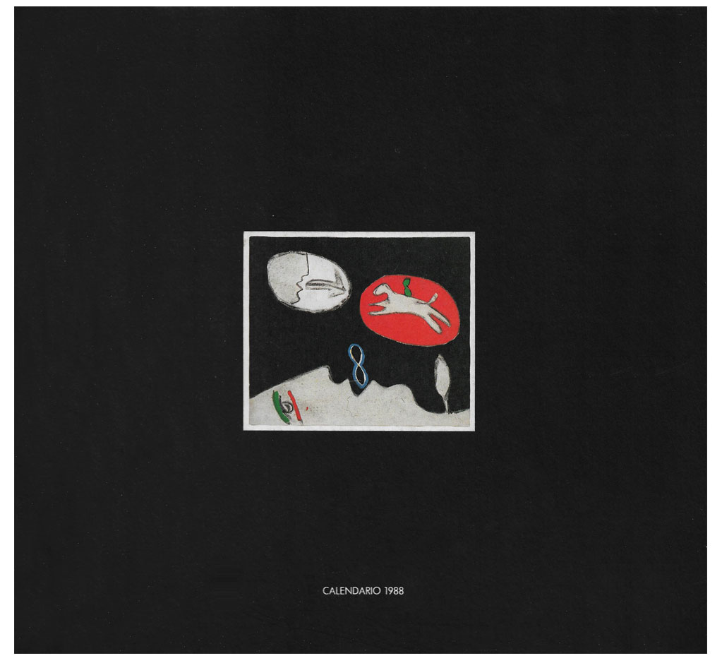
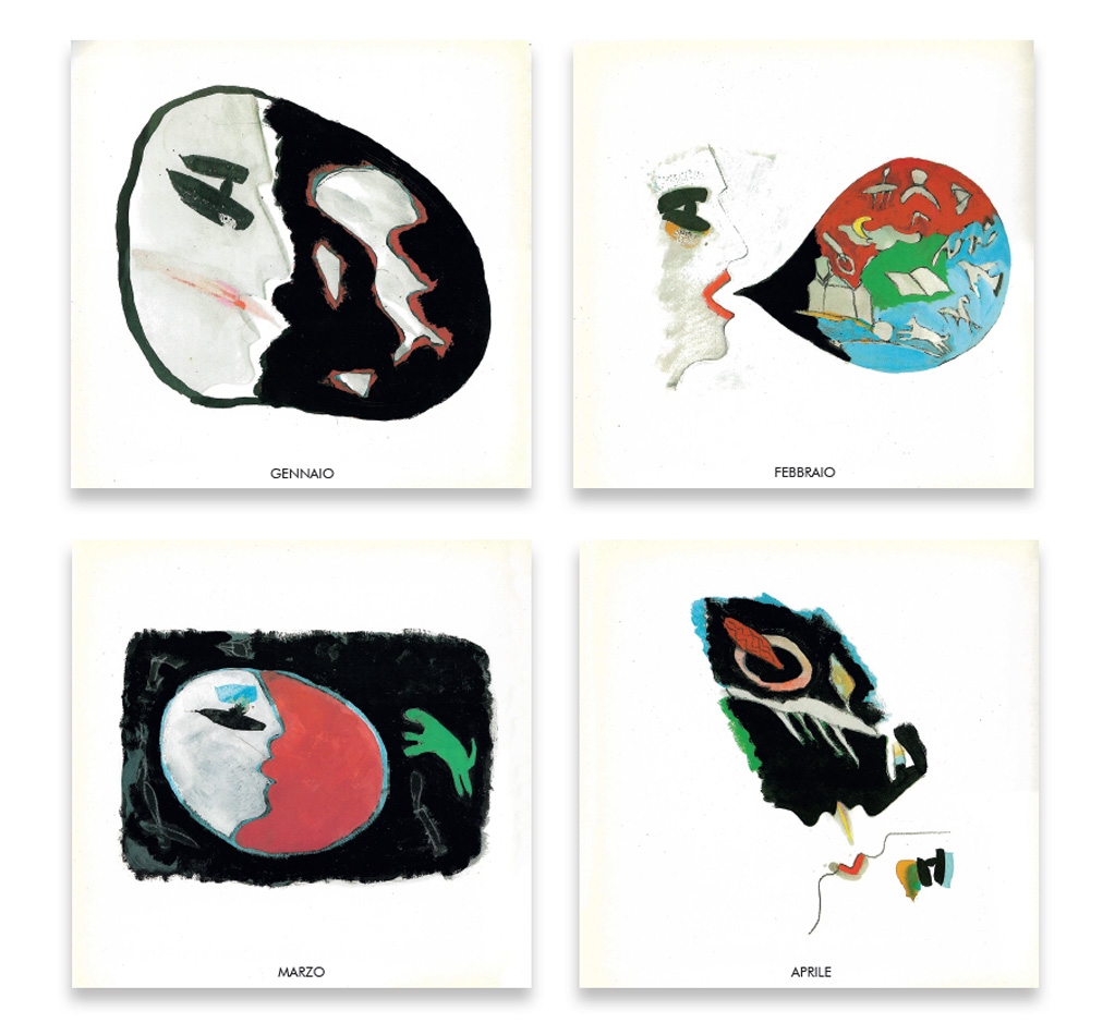
MIX WITH WHIPPED CREAM
Calendar 1988 – Book cover
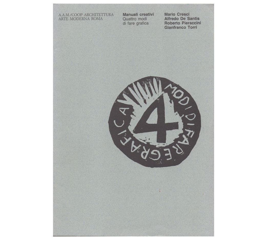
CREATIVE MANUAL
Four ways to make Graphics
Catalogue exhibition 1989
A.A.M. Modern Art Rome
STORYBOARD
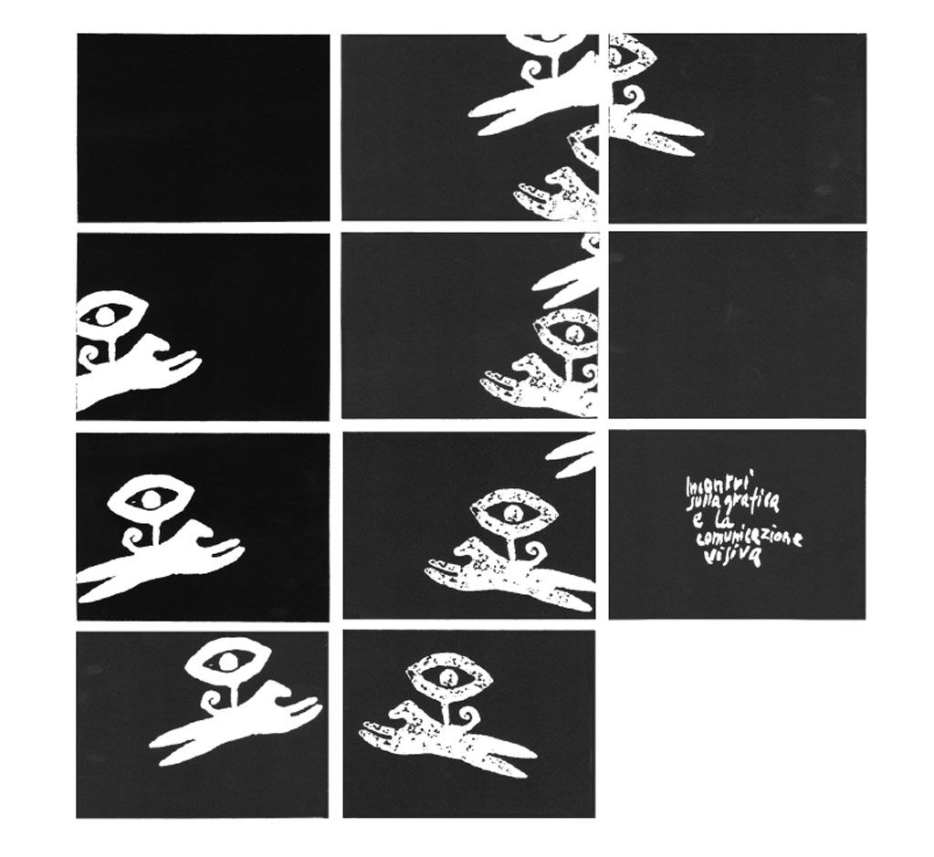
Animation graphics
Signs, sequences, stories
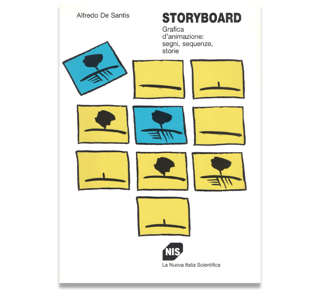
STORYBOARD
The Eye Carrier
Aiap Lazio, 1989
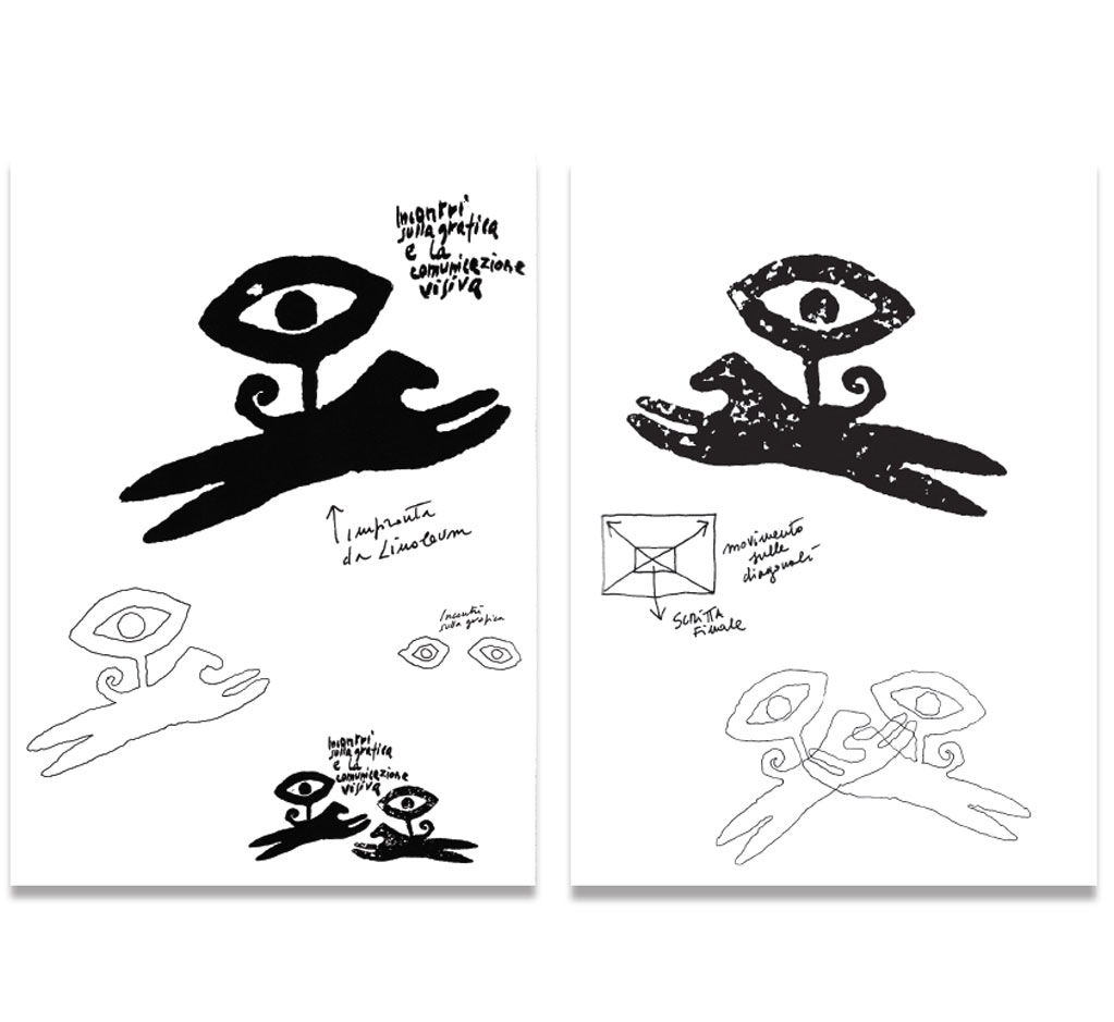
Theme for a series of meetings on graphic
and visual communication.
Aiap Lazio, 1989
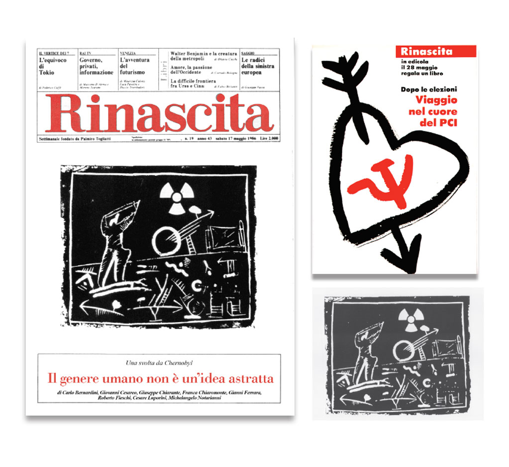
RINASCITA
Book cover
New graphic project 1986
Engraving for the book cover “Chernobyl”
Promotion for a homage volume
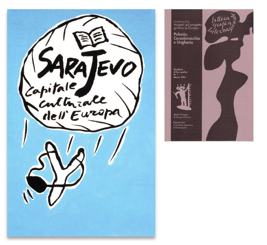
INTERNATIONAL GRAPHIC LETTER
Exercise book for graphic work 1993
European Institute of Design Rome
Poster Sarajevo
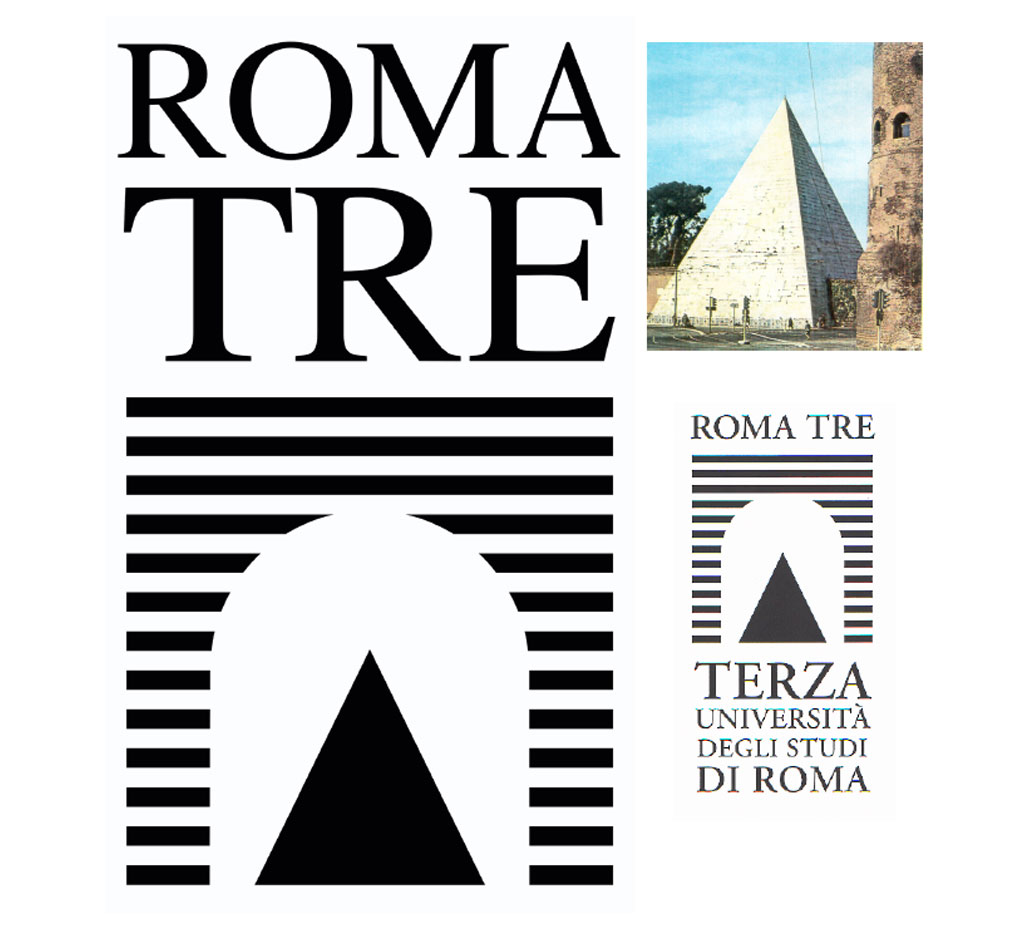
ROMA TRE
Logo of the University of Study Roma Tre, 1992
Photo of Cesta Pyramid
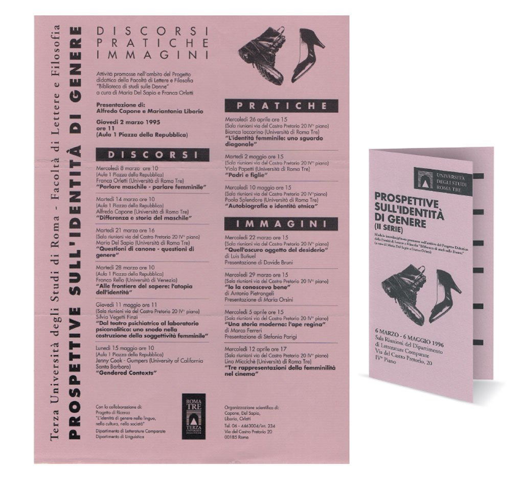
Poster and pamphlet
Faculty of Literature and Philosophy 1995
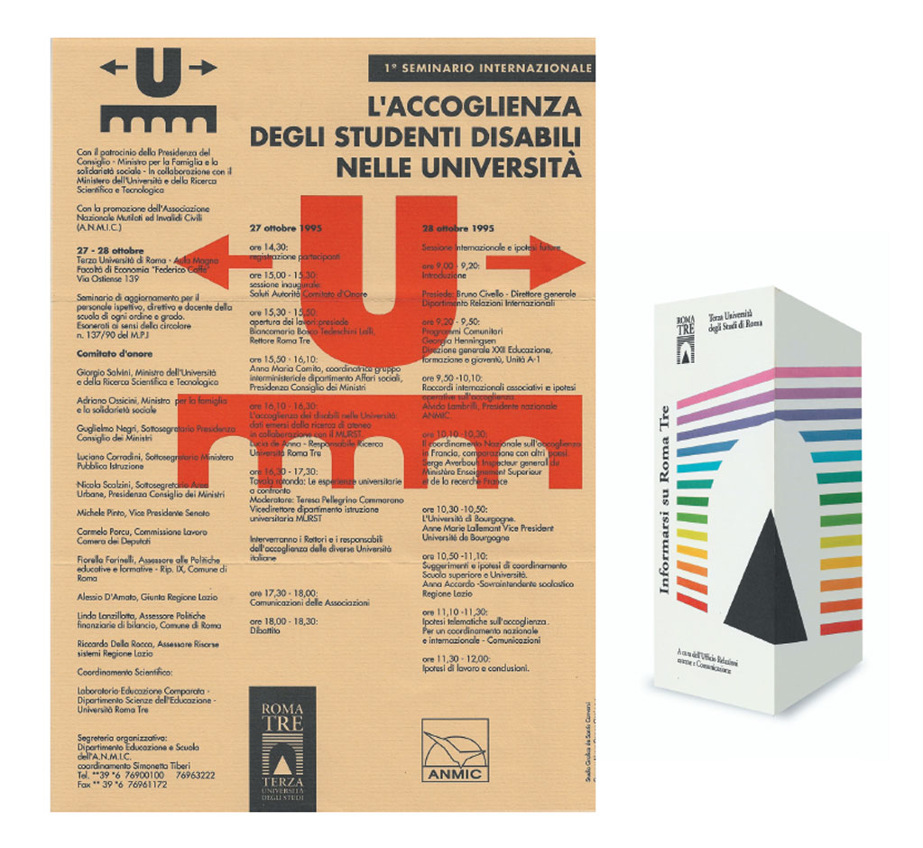
Poster – International Seminary
Pamphlet – Information on Roma Tre
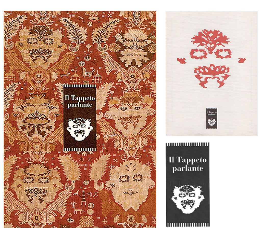
THE TALKING CARPET
Catalogue and Leaflet 1994
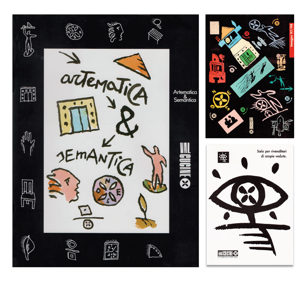
VALCUCINE
Printout for
Valcucine of Pordenone
Catalogues
Ads
THE HOUSE OF SIGNS
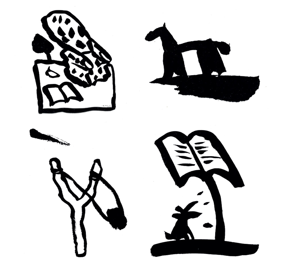
Everything happens in the moment when the ink-soaked brush approaches the grain of the paper and suddenly deposits the mark on it. The gestures are quick, the figures communicate with each other through small strokes just hinted at, left by a tuft of the brush. Sometimes I try to draw signs without the will to illustrate, and the scene to be interpreted appears on the white rectangle. Usually in these drawings I discover small marks that I will later make larger. I imagine in the room of my studio in Rome, a camera placed on the ceiling to take a plan of my movements, from the service table, to that of gestures, to the sometimes very long stops, between one brushstroke and another.
To the ink that turns from glossy to opaque, to the signs that slowly appear. The gesture table is covered with signs, which most of the time have landed outside the white rectangle, it is as if I have an infinite world at my disposal, they come back every time I start to paint, as possible models. But the gesture is always different, and suddenly the figure, the landscape, the house stop on the grain of the paper, like a lump of colour thrown from a slingshot. The distances between one gesture and another change according to the signs that appear, sometimes it is the brush and the gesture that refuse the elaboration of the exercise. In the end, contemplation reconstructs the path of the figurative story. Mixing the types of paper is like presenting different people, the brush always acts the same, but it is the paper that reacts differently, and therefore what happens suddenly on one type of paper, on another is done slower, it needs more gestures, more ink and during the contemplation, we can see traces of the different ways of absorbing the paper.
On the table of gestures in addition to ink, acrylics, oil, choline, tempera, enamels stop, as actors attend the rehearsals of their companions, careful to the falls, suddenly in need for gesture sky/earth, participating and mixing at times in a miraculous way.
Leaning against the wall like old scenography, there are canvases and cartons, small 25x30 - 30x40 sizes that coexist in perspective with the rest of the objects. The gesture table has a central part used for work, on the right and left in addition to the materials there are piles of paper sheets: they are the houses of signs, each floor a story. At my gesture table I approach standing up, and standing up I begin my gestural exercise. Seeing the birth of what is expected a moment before, and what can become unexpected. All this I can control with my body, I have to be standing and feel the light hand ready to mark, to lead the brush according to ever more different rhythms. It is almost always a figure that I establish its position with the white rectangle, the rest will rotate around it. So for weeks I deposit drawings upon drawings enjoying, while the pile gets higher, the future moment of contemplation.
ALFAZOO A CHILDREN’S BOOK
Alfazoo Emme Publishers,
Milan, 1967
I leafed through the small paste-up on the Rome-Milan train. I had all night to run through the story of Alfazoo, a children’s book I was going to suggest to Rosellina Archinto of Emme Editions in Milan. The title Alfazoo indicated (anticipated) an alphabet in which the letters, while remaining readable, would take on, through the addition of an eagle-eyed or a gaping mouth, the aspect of a bestiary. The book was printed, one letter a page, in one colour only: black.
THE FLYING CARPET OF SOVANA
1970 – 1974
Travel notebooks
Sovana was one of the fixed ports of call during my excursions to Maremma on my Guzzi Galletto 150. Sovana inspired large containers, parallelepipeds embedded in the ground with the tip pointing skywards; inside, sometimes in rows sometimes scattered about, sings, points, long stripes folding over themselves, now one way now the other, in a continuous ascent. The long stripes began to take over from everything else until they emerged from the earth and stretched out on their own towards the horizon: the flying carpet. From a photo of the painter Aldo Carpi sitting painting at an easel, I derived a silhouette and matrix so as to be able to cut it out on any kind of paper backing. Next I added the flying carpet which, stretched towards the horizon. I made drawings, designs for decorations, cover for periodicals, all with the same element, the flying carpet. I might draw it freehand or geometrically but it was ever present in my notebooks. I also used it to decorate a service of plates, using two colours, black and yellow. On a trip to New York I conceived of a blank facade with the flying carpet rising out of the base of the building to decorate the entire facade (the commission also was entirely imaginary in this case).
MARY’S ARMCHAIR
New York, May 1974
Rome, June 1984
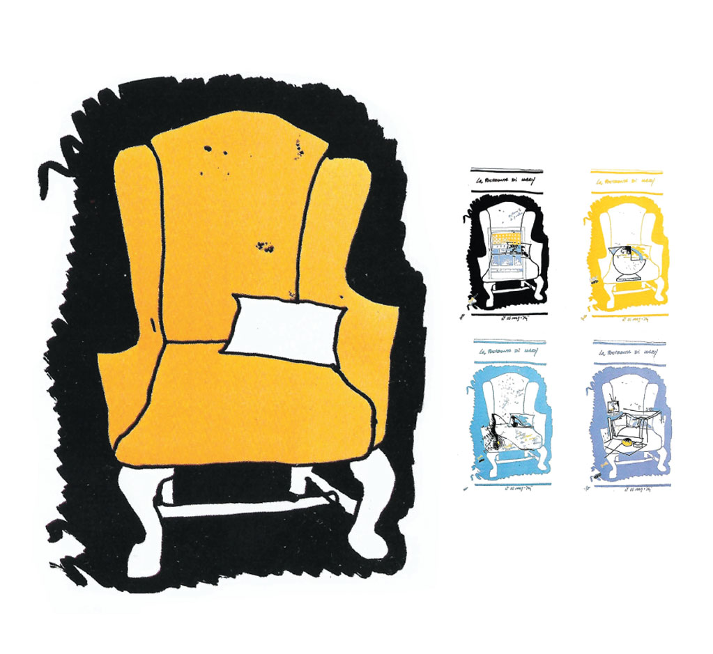
The drawing "Mary's armchair" was born in N.Y. in 1974.
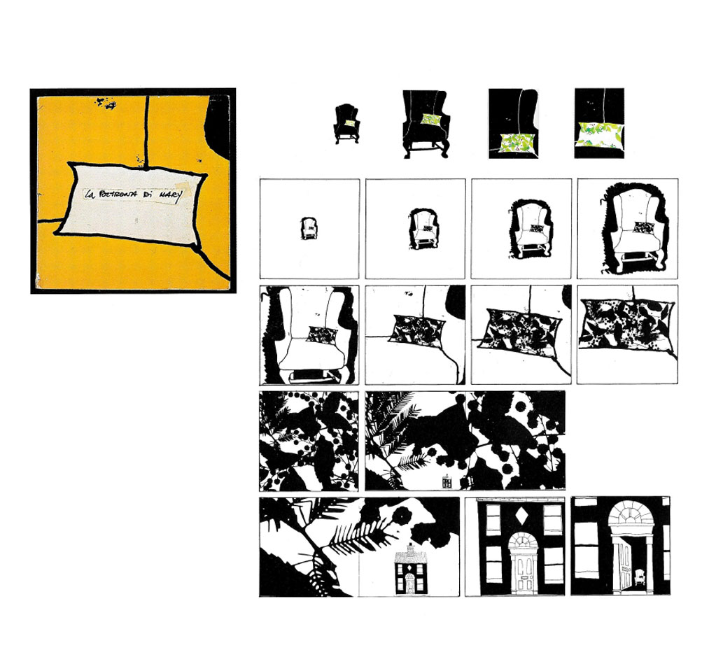
From that moment on, a research began on how to compose and decompose an image, on its possible relationship with the page / the poster, a book / reality.
Then begins a "discourse on the method". The book despite having the characteristics of the manual (technical solutions / materials / supports) reflects a mental process, a sort of reflection transposed on one's profession. The professionalism of drawing and painting, the image manipulator, the person struggling with relationships and meanings, the graphic designer, therefore, objects to some symbol of his work or all of himself. And from within his daily work emerges what he wants to be different.
The cushion was a present for Angelika Saleh, Carla and I were guests in her house in New York. As I went back into the house I put the cushion on the empty seat of the salmon coloured armchair which stood in the sitting-room, on the left as one entered. The positioning was so rapid and felicitous that in a little while I was already in front of them, drawing them both, armchair and cushion. For several days I had been drawing windows corners of the house objects Joe (Angelika’s husband).
I had filled a spiral binder with a lot of drawings, they were all in sequence page after page; I was working with few materials. I didn’t know that day the drawings of Mary’s armchair were to be the start of a long series of images and of details, that were to go on over the years.
Rome, June 1974.
Giorgio Fraire printed the first poster of Mary’s armchair for me. I had no intent, I only wanted to reproduce the original drawing at any mean: I removed the coloured signs on the cushion and printed a poster 70x100 in two colours. This was the beginning of the most wonderful adventure that would ever to happen to me. I convinced Fraire to print a portfolio of four armchairs. On each piece, printed like reflections on the armchair, the drawings of the house of Joe and Angelika Saleh.
Talamone – Grosseto, Agosto 1974. A Talamone per circa un mese lavorai a ridisegnare la poltrona, feci grandi disegni su carta da pacchi, usando lo smalto nero e giallo. Cercavo di usare sempre tecniche diverse, mischiavo di proposito gessi con smalti nei lavori grandi, o matita e pennarello sui blocchi. Conoscevo gli effetti della poltrona sui vari tipi di supporti, addirittura anticipavo le sue preferenze, amava essere circondata da un fondo di smalto a mani corpose.
Lavorando sul medesimo disegno per mesi, mi accorsi della rapidità che avevo acquisito nel disegnare i dettagli a memoria.
Fu questa rapidità a farmi notare un particolare sul quale poi avrei impostato la serie dei cuscini.
Ritagliai su cartone la sagoma del cuscino perchè questo mi permetteva una più veloce esecuzione su tutti i supporti possibili. Le tele sul cuscino, o cuscino su poltrona, le realizzai in grossa parte a olio. Tracciato il vano della poltrona e collocavo il cuscino tramite la sagoma o ridisegnandolo a memoria.
Cominciai con una serie di omaggi, a Morandi (presi un articolo di Roberto Tassi su “Repubblica” sull’opera di Morandi e lo incollai su di una tela centrando con il cuscino la foto del quadro), a Rotella, a Fautrier e infine il cuscino di Tex Willer.
Marcello Gianvenuti, un fotografo mio amico, realizzò una serie di impronte fotografiche su tela della poltrona, una delle quali è stata poi dipinta da Mario Schifano.
New York, May 1977.
During my second stay in the Salehs’ house l went over again in rapid sequence all the objects I had drawn the three years previously, re-drawing the armchair from other point of view; but the new images were very different from before. Of the many portraits made in that period, “Portrait of a woman with cushion” (a drawing on a small pad, done with felt pen and paper torn from a periodical to symbolize a yellow brush-stoke), is the only image of Mary; a woman’s face with a cushion in the place of her mouth. I’ve always thought of using this portrait as the poster for the exhibition (Mary’s armchair 1974-1984).
Sabaudia, August 1977.
I arrived in Sabaudia with many canvases and a great number of tubes of acrylic paint. I worked on a whole series of landscape cushions: within the outline of the cushion (often isolated in the centre of pieces of paper which I then stuck on a canvas) I inserted views of the Circeo or landscapes taken from various points of view and recomposed, I took the oleander that appeared out of the bedroom window, the Circeo in the background with a series of small pink houses at the bottom. These buildings I had already inserted on other cushions. So with a work of landscape fragments I completed what I now call the Circeo series.
The ceramic cushion - Rifa, 1978.
After the cut-outs I decided to make a cushion model. I wanted it to be of medium size, I needed to make a composition with other objects, palettes, frames, vases to make a series of still lives with cushion (a title l was later to use for almost all the drawings l made). I took the plaster model to my ceramist friend, Matteo Rispoli, in Molina, a small place very close to Vietri. From Matteo’s furnace came a ceramic cushion, the creases barely outlined, four pieces well-modelled, stable enough to allow me to place it next to other objects. The most frequent combinations were the cushion and a palette. I made various drawings, water-colours, on the theme of still life with pillow, I combined the pillow with a whole series of different objects, sometimes with a single colour. Finally I decided to make one last composition, “cushion with palette” with picture frame and glass.
Tele e disegni, 1983
Catalogare, numerare, ricordare i pezzi, scartare, è un bel fare, ma ecco affacciarsi l’idea di chiudere la storia con “Le poltrone od olio”. Grandi distese di prati con torri-poltrone o ruderi-poltrone o poltrone-totem, o poltrone-scale per immaginarie vedette alla ricerca di paesaggi. E infine il suicidio della poltrona: una tela 30×40 raffigurante una poltrona che salta nel vuoto da un fantastico ultimo piano.
THE PORTRAIT OF SOUND
Dumocks - Symbol for the study of a recording studio. Rome, 1976.
The image of a singer bending over the microphone. Sound waves, disarranged and recorded.
HITCHCOCK, BUNUEL KAZAN, BROOKS EACH IN 60 SECONDS
Television themes based on photo - graphic projects 1978 -1983
“60 seconds to be animated for television, the theme anticipates the cycle, each cycle, a character, let's start with Hitchcock.
“60 seconds to be animated for television, the theme anticipates the cycle, each cycle, a character, let's start with Hitchcock. Pietro Pintus, director of the series, gathers photographic material, set photographs, action shots, portraits, a series of photographic images in black and white. The title of the series “The morning of the magician” suggests which photo I should choose, it’s a portrait of Hitchcock in a bowler hat, starting from top to bottom to discover the bowler hat like a morning sun, and down following all the hollows and contours of Hitchcock's face. Going down on the left and going up on the right, a reading of a large portrait in black and white.
“The poisons and the dreams of don Luìs”: The titles of the films suggest the idea of the images, each scene a film, a large plan of characters, symbols, such as the eye, from the film "Le Chien Andalous", it is the eye that begins the overview of the Bunuel cinema.
Kazan the great, Kazan in black and white or rather, Kazan’s black and white, and against the black background appears the moving title Kazan the great, the font type is Koloss. A scene photo with Kazan as protagonist is the only image of the theme song. With the colours I emphasize the overlap of the photographs.
A set photograph from the film “Bite the bullet” shows Richard Brooks pointing off and on one side of the photo, semi-cut appears James Coburn. The title of the series “In search of Mister Brooks” becomes the caption under the photograph of Brooks. I pick out Brooks from the background of the photograph and his gesture becomes the photo-graphic design for the whole title”.
THE SILHOUETTE
Graphic design
The days of the silent film festival
Pordenone 1982
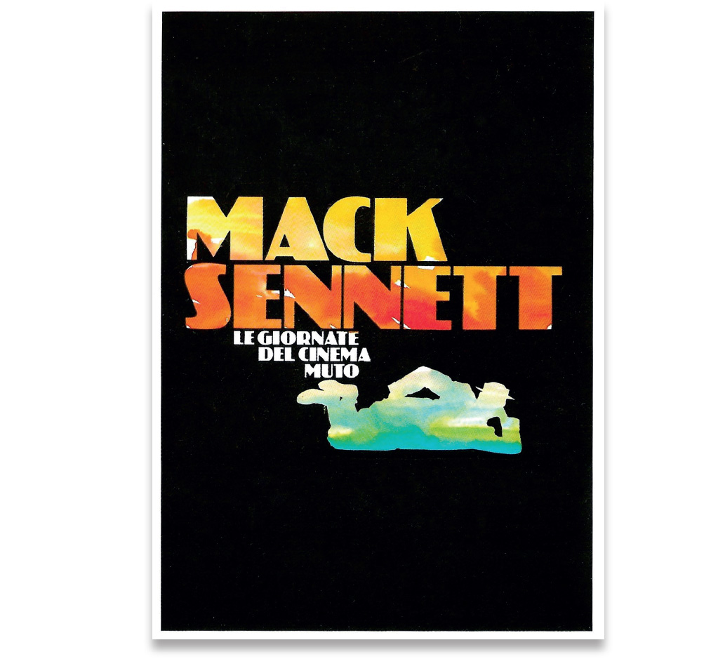
I have to create a graphic solution for “Cinemazero” in Pordenone that is valid from year to year, at each presentation by different authors, to whom the Days are dedicated.
The solution comes from a cinematic image: I leaf through Robert Benayoun's book "The Gaze of Buster Keaton" and I come across the image of Donald O'Connor (yes, he is the one from "Singing in the Rain") lying on a side.
It is an image of "the Buster Keaton Story" he played. This is the solution: Donald's upturned shoes become the support of the writing with the name of the author proposed by the Giornate.
I extrapolate Donald's silhouette from Benayoun's book with the help of the camera lens. From positive to negative: now I have the whole surface of the body in white, ready to receive various images, gradually suggested by the programming of "Cinemazero" the strong cinematic sense of the Keatonian silhouette has allowed its continuous use throughout the programming, even for distant and different situations such as the Thomas Ince cycle.
THE PINK SKI
The graphic image for the women’s
downhill and slalom races in the World Cup Championship at Piancavallo,
Friuli V.G., 1980 - 1986.
“Six years of images of the women’s downhill and slalom in the World Cup.
Giancarlo Predieri, organizer of the Cup, commissioned me the graphic image.
And so my journey into the world of sports graphics begins. During the days of the cup, from hats to bags to posters, everything is aligned, is composed, confirms on the white of the snow.
The sponsors delimit the spaces with their coloured banners, there is an incredible variety of signs and colours, in a continuous reciprocal interaction”.
THE LUMINOUS POINT
“Teleconfronto” - International Exhibition of telefilms.
Graphic images 1983 - 1986.
“Teleconfronto: the T and the C are the letters that attract me. In the first formulation the T immediately divides the two Cs: the encounter of two hemispheres. Really everything is born out of a luminous point which gradually grows large through cinematic progression until it becomes a small globe and divides into two concentric semicircles: at that point appears the T. This progression then becomes the opening title of all the telefilms presented at the festival. The sketches from the story-board are transformed into the poster of the program. The images of the symbol move from the video to become fixed in poster and handbills. The symbol is present everywhere in different sizes: for road signs, silk-screen printed sheets are used with the symbol imprinted and mounted on iron frames Seen from a distance they look like large portraits. It’s precisely the portrait that provides the idea for dis composition: I move the elements between them giving a new meaning to the symbolic T. The buildings that houses the exhibition, circles and semi-circles are the ideas, the stories, the images, the countries, the world. The circles multiply, they are suitable to being cut, they overlay pencil drawings, finally they multiply to take position in boxes, setting, and on horizon lines. Finally yellow and blue colour a landscape where the circles and the semi-circles will settle”. Today, 1986, I have gone back to the portrait where the symbol of Teleconfronto takes the place of a gaze.
MANIFEST SIGNS
Illustrazioni periodiche per il quotidiano “Il Manifesto”
Bologna, February, 1985.
“I’m the only client in the old shop of artist’s materials in Piazza Galvani: outside the snow is dazzling and deep, maybe even a metre. I ask for a quarter bottle of black Pelikan. Coming out of the store I could have begun a sort of discourse/gestural exercise that the snow was insistently prompting me and which I was already pre-figuring to myself. Perhaps a reclaiming of the cinematic black and white that we see now only in old films at the film library or offered by the reclaiming video. Indian ink and brush; and paper, lots, of all kinds; the hand spreads out, it’s always a human figure running against horizons, or carries, lifts details of horizons, sometimes so wide as to contain landscapes houses trees. The gesture becomes more and more relaxed (once the bearer has been established), to the advantage of the increasingly autonomous contour signs. The gestures of many and random, to wait for their determination to continue the story. I'm looking for a support where I can verify the gestures, understand how much they can coexist with texts, titles, perhaps a newspaper, also given the speed of execution. A newspaper that has a graphic design willing to house signs of all kinds. The choice falls on "Il Manifesto". I take an appointment with Pasquale Gioffre, responsible for layout; I show him a series of signs, offering to work with him”. Since then, lodged among the print, the gestures occasionally appear on the pages of the newspaper.
CIACK
Periodical illustrations for the daily newspaper “Il Manifesto”
Graphic imagine, Rome 1985
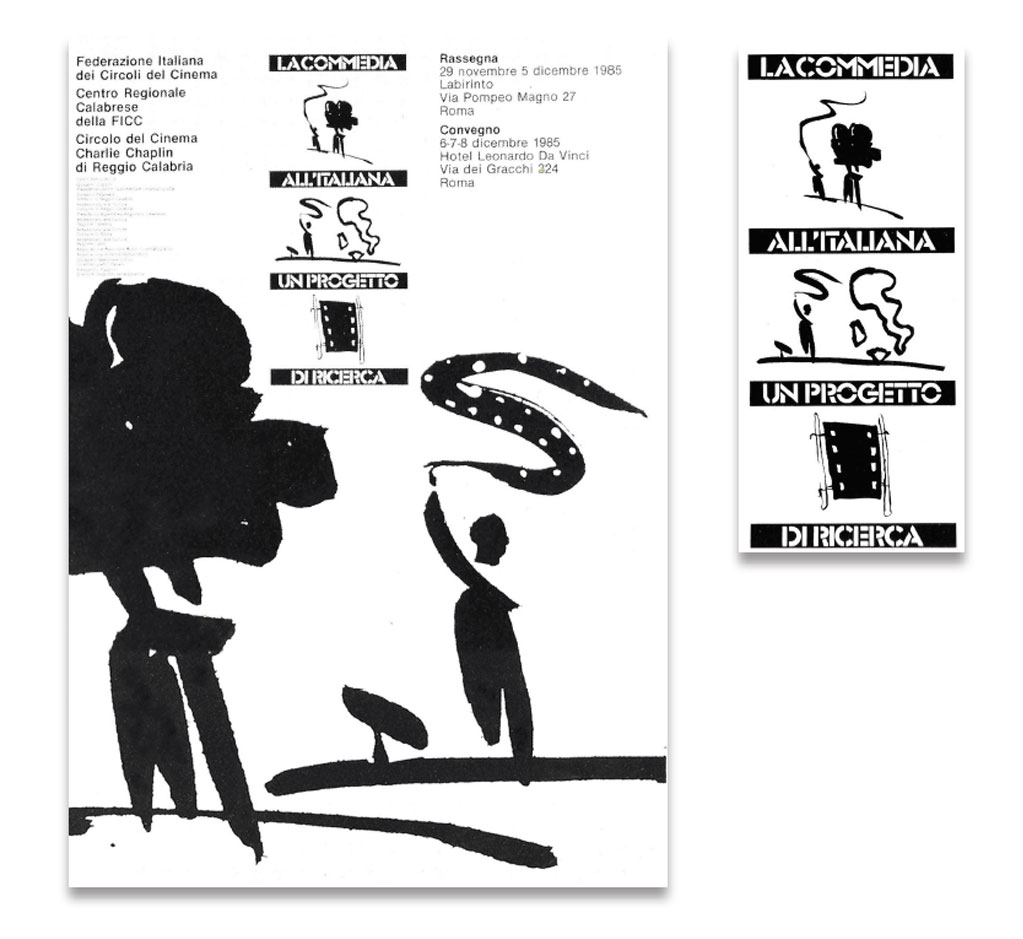
“I have to draw for Film Clubs the graphic image of “Italian-style Comedy”, a panorama of films from “Vivere in pace” (1946) directed by Luigi Zampa, to “Un borghese piccolo piccolo” (1977) by Mario Monicelli: 30 years of cinema. The initiative includes meetings, film festivals, round-tables, conferences, attempting to give a re-reading (initial arrangement) of the films and lines of development that gradually emerged in this sphere of the genre. I begin to draw a silhouette of Italy in the centre of an arrow (film) strip, then, I draw stills, factories, film cameras, men waving long strips of film. I have various signs available, I choose the man and the film camera, the man and Italy, and the photogram stretched tight between two poles. These are the elements of the graphic image, I choose the Glaser-stencil for the printing, and as if they were titles to be read from top to bottom, I mount the image of “The Italian-style comedy a research project”.
THE PAINTER’S MATERIAL
Oil on canvas 1980-1984
“A horizontal line or several lines, seen from the train, from the car, on a Vespa, from the windows, through half-closed eyes.
Searching for vertical elements that rest on or bury themselves in the horizon.
The trees, with great luck a piece of roof.
At the foot of a tree a palette has the look ofa a boulder, perhaps witness of the stop over of a painter of the past.
Spaces with grass of different colours, meadows on which are scattered the objects of painting.
The rest periods of groups of painters.
Farther off, an armchair with a tree. Inside the hotel, armchair with window and sunset. The canvases rise, bury themselves in the ground, every painter chooses his model, the landscape becomes populated with figures, the objects scattered on the meadows are gathered up, the brushes swell with coloured paste, the landscapes multiply, each gesture a sign, the sight is thrilling.
The camps of painters are usually to be found on small hills, the poles are fixed in the ground with spades for the purpose, for a good 40-50 centimetres. Stability must be perfect, on the canvas is mounted it must be well stretched. The location of the camps is decided by the group of painters, on maps traced after a series of surveys made in the lapse of the four seasons, during which the sketches (painting – polaroid) will be used as a study.
With great luck in certain parts of the country sometimes it is possible to see miles of camps with painters at work”
With great luck, and imagination, of course.
MARKED WORDS
Written words, defined with a sign, narrated with signs.
Suddenly, according to the sedimentation of the word or phrase in the mind, in everyday thoughts, the word the phrase becomes a sign-writing like the "Pandora's box". A graphic exercise to get more and more into the meaning of the sentence.
And what a marvel after a few months to read the same sentence, in an article in an Italian newspaper that quoted "Pandora's box" comparing it to the Italian political-social situation of the years 1992-1993.
The graphic or pictorial exercise stops when it becomes aware of the different use of the phrase (journalistic metaphor).
The memory returns to remember how the sentence appeared to us, on what day, whether inside or outside the workplace (studio), what signs or similar signals contributed to the decision that from that moment onwards the exercise daily chart was to display "Pandora's Box".
Remember that the flow of signs came as a different need, (a sort of self-commissioning) visualize concepts, places, links, pieces of history, everyday life, daily newspaper reading, talking to people, the need to make certain concepts visible through one's profession.
Now the path of this methodology is clear, everything comes back to mind.
The release for Einaudi essays of the book "Pandora's Box" by Dora and Erwin Panofsky becomes the ideal palette for the calligraphic exercise, the captions of the illustrations "Demons and snakes come out of the vase", "Pandora's cornucopia", "Pandora suffocated by the vapors emanating from the box fails, and is saved by the intervention of Cupid".
They are exceptional incitements for visualization. The iconographic sources within the book sometimes become models, not to be copied, but to be interpreted in the various daily graphic drafts.
So we (found) also the editorial support (the book), but it could have been an exhibition, a video, a single illustration.
So in this drafting of signs, there are also different supports that help to improve and specify more and more the project to be carried out.
I wanted to briefly reconstruct the various phases of this methodology because it can be applied in the field of visual communication to design an image (brand-logo), a cover, a poster or anything that adheres to any surface.
Alfredo de Santis
Rome, October 1997
